Small restaurant designs can be beautiful and functional. Running a small restaurant can be a challenge, with limited space and having to manage the flow of customers and wait staff. Most of the time hiring an interior designer might be way out of budget. But even with a tight budget, the right touches can turn your small restaurant into a beautiful place for dining. Here are a few small restaurant design ideas to get you started.
#1: Play with light for a bigger space
If you want to open up the area, stay away from dark shades that enclose and trap light. Use soft-light exposed bulbs, and translucent or metallic fixtures that will reflect or play off of the light. Light can bounce off of the room, which will create the illusion of a larger space. And natural light is your best friend. Use your window space wisely, or invest in installing larger windows, to let in the natural sunlight and brighten up the room.
#2: Use artwork to set the tone
Incorporating artwork into your small restaurant design can set the tone and atmosphere of the room, and when used correctly, it can help your restaurant space feel bigger. For a trendy look, try making a focal wall filled with artistic frames. Or, to set a sleeker tone, pick a few pieces of art that hang in a straight, vertical line across your wall.
Typography is being widely used now as well and can make a bold statement on your walls by adding a message, chart, or diagram in an attractive print. If you are looking to get more light in your small area, try placing mirrors strategically on the wall to reflect the light to make it seem larger.
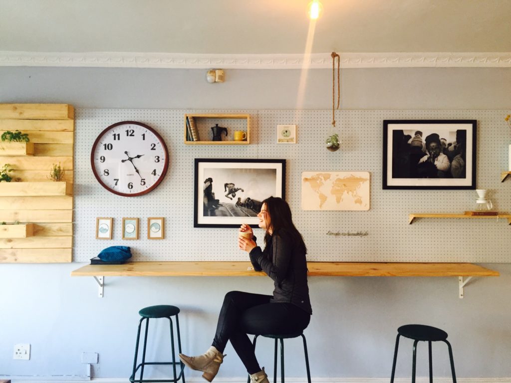 A soft-light bulb (#1) and artwork on the walls (#2) transform this narrow wall into a cool bar counter
#3: Play with paint and colours
Color schemes are vital in designing a small restaurant space.If you want to retain the cozy, intimate feel of your restaurant, choose some darker colors that achieve your desired atmosphere. Or, opt for a darker accent wall if filling the space with a dark color makes it feel too small.
As a rule of thumb, if you are working with a small space, the lighter and brighter colors are going to make the room feel larger and more inviting.
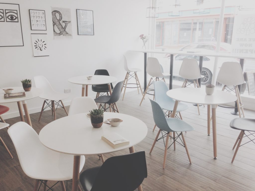
White furniture and walls make the space bigger, playing off the light being let in
You can dress up plain white walls with pops of color in your artwork and furniture, or keep a minimalist, neutral color theme throughout your restaurant. Using pastels in your color scheme are also a good way to incorporate color without darkening the room.
#4: Find a use for everything
In a small space, every area needs to be utilized efficiently. This means that storage becomes decoration, and vice-versa. Look for things that can have multiple uses when designing your small restaurant, ie. using crates as focal pieces on your wall where you can also store items, placing a ladder against the wall to hang menus, or ditch the printed menus entirely and use a large, artistic chalkboard with the food options listed.
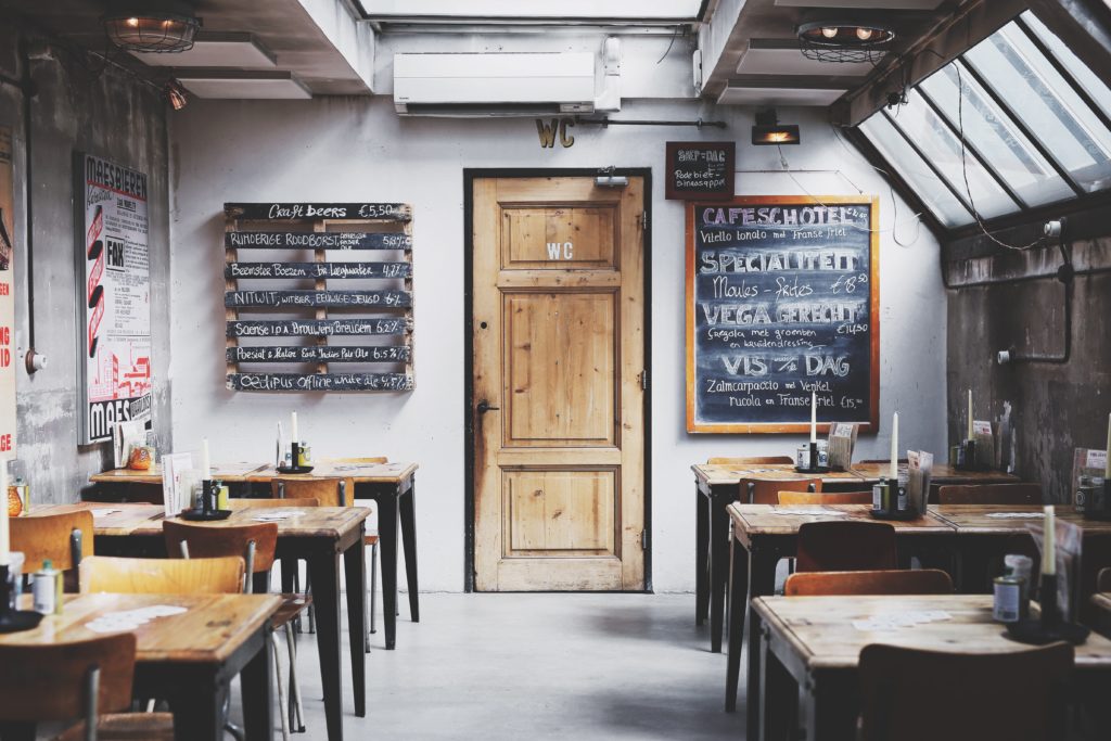
The menu boards serve both functional and artistic purposes
Thinking of multiple ways to use your decor that will also be useful to the functionality of your restaurant will save you space and allow for a better flow, while maintaining the aesthetics. And, featuring the name of the restaurant helps with branding.
#5: Play with Partitions and Spacing for Flow
When designing a small restaurant, the layout is key. You will need to figure out the most functional layout, while still utilizing the most space possible in order to serve a high number of customers at a time. Be careful not to clutter your dining area though, or customers as well as employees will not have a good experience. One idea to help create space is to build a counter style, bar-seating area facing the street window so customers can get a view, which will also leave you with more floor space. Try to avoid big, bulky pieces of furniture that will get in the way, and opt for more modern, sleeker seating options instead.
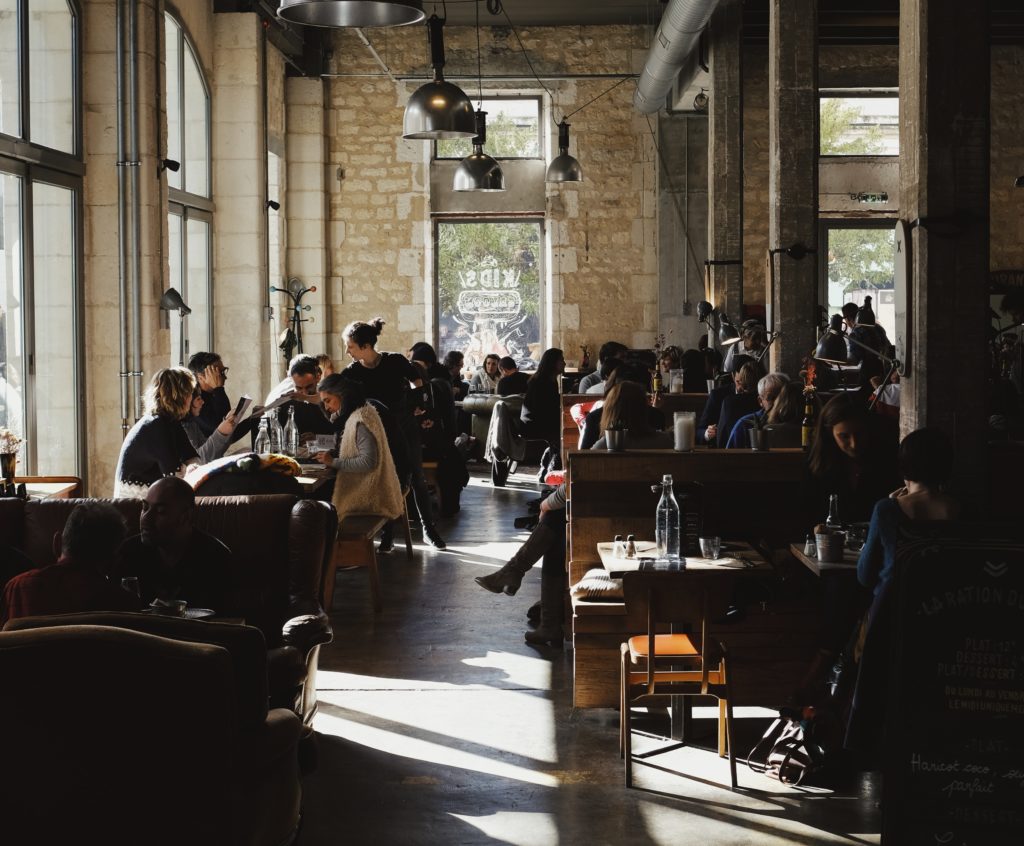
Pretty crowded, but there’s a clear path for both customers, servers and light from outside
Although space may be limited, there are still some places where you might need a separation in your small restaurant. You will need a creative way to break up the dining area from the entrance, the kitchen, and the bathrooms. You also want to make sure the middle of the dining area is not too cluttered with tables, which makes it difficult for your servers and customers to maneuver around. Use screens, large plants or plant walls, or an interesting wooden partition to help section off your restaurant in a functional and fashionable way. You can use booth-style seating to break up the space, or build a table around an existing pole in the middle of the dining area to provide more seating while remaining functional.
#6: Print and Pattern
Fun prints and patterns can elevate your small restaurant design and keep it interesting without adding more clutter that takes up space. Patterned floors are trending right now, and certain patterns can help give your room a pop it needs. Geometric-pattern or checkered tile flooring when done well will help create your desired atmosphere. Or, choose wood-flooring in an interesting pattern that mixes dark and light woods.
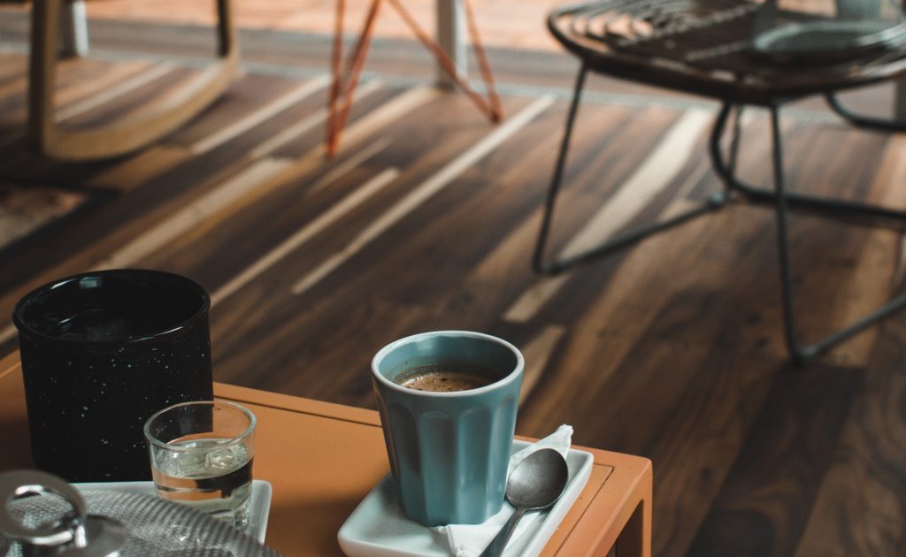 If you are opting for a lighter color scheme to keep an open-feel to the space, consider using a specific print that will help give a pop of color or to intrigue your customers.
Designing a small restaurant doesn’t have to be restrictive
Smaller cafes, pubs or restaurants maybe more compact, but it doesn’t have to be cramped and cluttered. Setting out with a clear theme and these 6 design ideas to put a smile on your customers’ faces.


