Looking for a great restaurant logo to match your brand and mouth-watering cuisine? A great logo can help you be unique and stand out against other countless restaurants on food delivery apps and social media.
Boy, have we got you covered. We looked into the best qualities, tips and tools into what makes a restaurant logo eye-catching and effective, and compiled a list of best restaurant logos that will inspire you.
Let’s get started with our comprehensive guide to restaurant logos:
1. What is a restaurant logo?
A restaurant logo is a symbol for your restaurant and your brand. A restaurant logo is the first impression most customers will have of your restaurants. It’s even more important these days, when most customers choose restaurants online or through apps: the logo becomes an idea that describes your brand, your food, and your entire establishment.
Sure, but what makes a good restaurant logo?
- A good restaurant logo is tempting: A good restaurant logo can entice customers to dine at your restaurant for the first time – even without having tasted or seen the food being served. Think of it like a profile picture for your restaurant: you want something inviting, welcoming and interesting.
- A good logo helps you to build your brand. Returning customers will associate their great experiences with your logo and come back for seconds, or even look out for your logo when searching maps or ordering online
- A good logo tells the story of your restaurant: Your logo has to clearly reflect what your restaurant service is like: what type of food you serve, the price range and how your customers will feel dining in your restaurant. It doesn’t matter whether it’s Restaurant Andre or Starbucks – your logo tells the story of your brand – but customers should not be expecting a fancy French restaurant and discover a dive bar
- A good logo helps you stand out: If every restaurant has a logo, whatm makes your logo unique? Most salad bars have green logos, most bakeries incorporate the shape of a loaf or baguette. Your logo should be appealing to customers, but also stand out against competitors and imitators.
Your restaurant logo is a visual representation of your restaurant. A good logo might be the difference between customers getting curious and giving you a try, or ignoring you and scrolling/strolling by. A great restaurant logo could be as important to your success as the interior design of your restaurant!
Why are restaurant logos important?
Now that we’ve discussed what a good logo could do, here’s why you should think about your logo:
- Your Logo Is Your Brand: Restaurant logos represent a restaurant’s brand. Your logo is how your customers will identify you across all marketing or ordering platforms. platforms. You want your logo to be linked to good memories of your restaurant. Mention the Golden Arches and people think of McDonalds.
- Your Logo Tells The Story of Your Restaurant: Your logo can be a way to celebrate your heritage, or the family recipe, or even tell the history of your restaurant. That helps customers build a bond and relate to your restaurant. Look at the logo for Pylos:

Source: pylosrestaurant.com
The Greek letters emphasize how they keep with tradition, and emphasize rustic Greek cuisine. The word ‘Pylos’ is a Greek word for clay artifacts that give us an insight into ancient Greece. We know exactly what to expect from the restaurant, and those looking for an authentic Greek meal will be tempted to give it a go.
- Your Logo Helps You Stand Out: A great restaurant logo can help your restaurant to differentiate itself from other restaurants in food recommendation or delivery apps such as Grubhub, Seamless, Uber Eats, etc
Compare these two images:
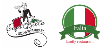
One is from Tripadvisor, the other from a freelancer.sg design contest. Can you guess which?
Both are Italian restaurants, but which logo stands out more? Ciao Bella seems to have more personality and more authenticiy, compared to the more generic Italia Family Restaurant, which looks like a franchise chain.
Elements of Restaurant Logo Design
- Colour: Every color evokes different emotions and reflects the style of your restaurant. Having some knowledge about colour theory can go a long way, considering how you want your customers to feel when they see and think of your brand. You may even consider how your logo will look if it is printed without colour so that it still stands out. Syncing your logo colours with your restaurant theme can strongly influence your customer’s decision during food orders. For example, fast food restaurants often use brighter colours such as red and yellow, while fancier restaurants tend to stick to muted or black-and-white themes. Also, when testing out logos, make sure it doesn’t look too similar to competitors, especially if they are in a similar area.
- Fonts: Whether composed with an image or standalone, fonts are great at representing your restaurant brand. For instance, Sans-serifs presents a casual look while Serifs are usually formal.
- Shapes/Symbols: Logos that incorporate circles are more relatable while primarily black logos look more sophisticated. Bold graphics, for instance, may be more suitable for modern restaurants than a traditional restaurant or casual diner
- Scalability: Your logo might be printed on objects as small as a sweet or as large as a billboard so it is important for your logo to be clearly visible on all surfaces and size. Consider using a design grid while designing your logo so it doesn’t get distorted or stretched while you are enlarging or shrinking it.
- Other Logos: It is important for your logo to stand out from its competitors. Looking at other restaurants’ design choices are great at helping you create an original restaurant logo and learn how to distinguish itself from other restaurants. As a helpful resource, we’ve included a list of great restaurant logos later in the article.
Where will I use my restaurant logo?
Your restaurant logo can – and should be – everywhere – on your restaurant signage, printed cards, cutlery, merchandise. But we can narrow down to the three most important places where your restaurant logo can be shown off:
Social media & Websites
Your logo should be on all your owned digital platforms. Start with your website, and social media profiles. You should also make sure your logo is visible on delivery/ordering platforms, food review sites, and on any apps or discovery platforms – this is how you turn online customers into foot traffic, and offline diners into online customers.
Menus, packaging, cutlery, etc
Never miss an opportunity for branding. If you step into a global franchise chain like Starbucks or McDonalds, you’ll notice everything is branded – from cutlery and straws, to sugar packets and napkins, and even food packaging and bags.
For smaller restaurants, such branding can be expensive, and may be lower priority. But, the rise in food delivery services like DoorDash makes branded packaging important again. If your customers order online, they might not get to see the inside your restaurant at all – so the logo on the delivery boxes could be how they remember the lovely meal, and think of you to order again the next time.
Corporate branding, crew, merchandising (eg Taco Bell Sauce, Starbucks, Instacoffee
Finally, a good logo stays with you, even when you diversify. Bigger F&B brands like Taco Bell, Starbucks or Instacoffee have diversified to offering products you can get in the supermarket. The logo serves as a way to bring loyal customers to the new product.
How do I make a restaurant logo?
A good three-step process is to search for restaurant logo ideas, do some brainstorming of your own brand qualities, and then create a restaurant logo.
For inspiration, we’ve curated a list of the best restaurant logos in the next session. You can also search for logo ideas online.
Hire a freelance designer: Working with a freelance designer helps you to get your logo designed professionally at a cheaper cost than a design firm. Price can also be a big factor: 99designs has a useful guide to how much a logo design should cost.
Restaurant logo maker: A logo maker allows you to make your restaurant logo from scratch. Various tools are available from free, simple tools like Canva to more sophisticated, professional tools like Adobe Illustrator.
Professional logo design firm: Hiring a design firm allows you to have a professionally custom designed restaurant logo. It will cost more than a freelancer but they will have the expertise to assist you.
What are the best restaurant logo makers?
Using a restaurant logo maker is another way to help you, but usually advisable only if you have a limited budget at hand. As the face of your brand and restaurant, your restaurant logo is very important and if it is not professionally designed, it may not be as effective.
You can give these restaurant logo makers a try:
- LogoMakr – A free tool with a huge graphics database to use for your logo.
- Looka – for online templated logo designs, you may pay to customize them to create your logo.
- Canva – Free to work with your own images and purchases from their libraries are pretty affordable.
- Pizza Logo Generator – great for pizza delivery services and pizzerias.
- Italian Restaurant Logo Creator – for Italian, Mediterranean and Greek restaurants.
- Burger Logo Maker – great for burger trucks, take-away shops and burger bars.
P.S. Canva also has options if you’re looking for punch card designs.
What are the best restaurant design firms?
Below are a few ways that you may source for a designer to assist you with your restaurant logo:
Best restaurant logos
Here are our list of best restaurant logo examples to help bring out your creativity for creating that great memorable logo for your restaurant.
Logos of Famous Restaurants
We noticed that famous restaurants tended to have logos with minimalist designs. The logo feel upscale with elegant fonts, precise hand-drawn elements and elaborate styles.
i. Central

Combining its mouth watering food with an original typography of its name as a logo, its use of black and white creates a minimalist look that speaks of creativity and prestige. This makes it eye-catching for its customers who know of its culinary masterpieces and reputation.
Overlooking Madison Square Park, one of the most beautiful parks in Manhattan and located at the base of a historic Art Deco Building, its simple memorable design reflects its location and name. This logo speaks for itself especially for its reputation of being known as the ‘World’s Best Restaurant’ in 2017.
iii. Azurmendi

Known for being one of the most beautiful restaurants in Spain, this attention grabbing logo features a unique typography of its name, an interesting font and 3 asterisks to represent its 3 Michelin Star status. The colours and the logo match the restaurant’s prestige and fine dining experience, making it an effective logo for the restaurant.
Iconic Restaurant Logos (5 logos)
I’m sure you’ll recognise these logos! These are some of the most iconic and visible logos.
i. Starbucks
Source: designevo.com
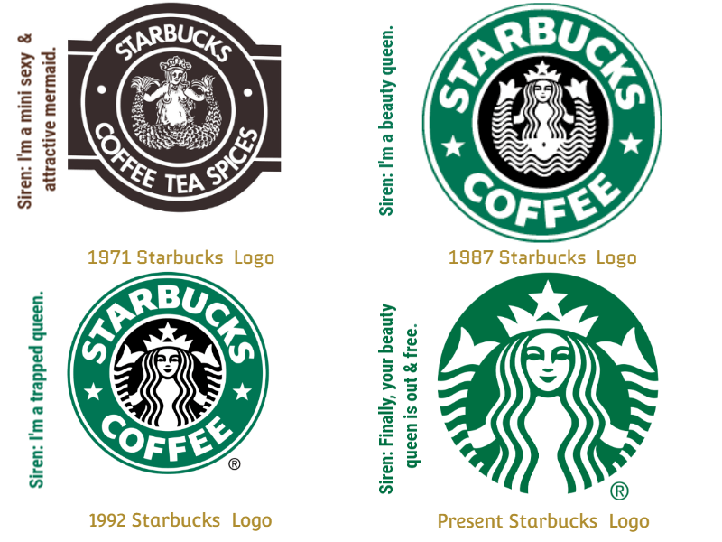
The Starbucks’ green mermaid logo originated from a sixteenth-century Norse woodcut of a two-tailed mermaid, circled by the company’s original name, Starbucks Coffee, Tea, and Spices.
As the most well-known cafe in the world, it is known for a simple and clean logo with the image of the mermaid in green and white colours as its brand. Notice how the logo ‘evolves’ by reducing the number of elements and becoming cleaner: the mermaid illustration becoming simpler and more stylised, and the colours going from green-black-and-white to just green-and-white.
Also note that the current Starbucks logo doesn’t even bear its name: that’s how powerful Starbucks’ marketing strategy and billion-dollar loyalty program has become.
ii. Chick-fil-A
Chick-fil-A has 13 million members enrolled in its loyalty program. This chicken restaurant is best known for its “C” letterform in the shape of a chicken that reminds customers of its signature toasted sandwich with two pickles on a toasted bun.
Its name is a play on ‘chicken fillet’ with ‘A’ capitalized to represent the ‘Grade A’ chicken used.
iii. Domino’s
Domino’s is one of the most well-recognized pizza delivery restaurants: and no wonder. The logo is simple and clean, and with bright colours to attract more customers.
The three dots symbolize the first store and two outlets that were open at the time. Over the years, the’ve adjusted the colour and the angle, but the iconic one-two domino and bright blue and red colours still remain.
iv. Dunkin’ Donuts
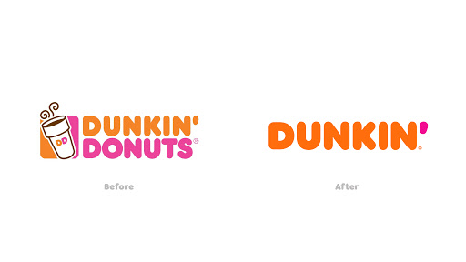
Dunkin’ has undergone brand evolution since we first wrote about the DD Perks loyalty program. ‘America Runs on Dunkin’ used to be their slogan, which referred to their coffee. Perhaps the donut/coffee confusion led to their redesign, but it’s another example of brand logo becoming simpler and more refined.
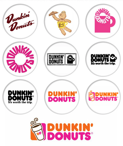
A brief history of Dunkin Donuts Logos via www.deputy.com Notice the theme of the coffee cup across the iterations, and the re-appearances in the more recent versions of the logo
In 2019, they decided to simply change the logo to just ‘Dunkin’ as its affectionate nickname and retain its pink and orange colours, and iconic font. As you see in the image above, it has undergone a lot of major changes before getting to where it is now.
v. Subway
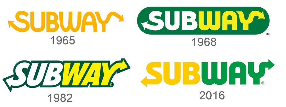
Known for their prompt service and fresh food, Subway is one of the world’s most well-recognized restaurant logos and has one of the most number of outlet locations in the world.
Once again, the famous sandwich chain has undergone a series of evolutions, though some themes are clear: the green and yellow, and the two arrows at the bottom of the ‘S’ and top of the ‘Y’ to show their commitment to fast service: quick in, quick out.
Source: blog.logomyway.com
Fast Food Restaurant Logos (3 logos)
In a fast food restaurant, customers expect fast service and food that is ready to go. It is very important for your logo to stand out and reflect the satisfaction of your food as customers spend short periods of time in your restaurant.
Source: Noodles & Company
Known for its signature noodle dishes, this simple logo catches your eye with the white coloured ‘noodle’ font on a striking red background and a cute yellow noodle image.
ii. In-N-Out Burger
Source: marketplace99
This logo resembles a double drive thru restaurant where a metal awning provides shade for customers who wish to park and eat. Its signature colours white, red and yellow, combined with the big yellow arrow makes the logo very effective as it is striking and easy to see when driving around.
iii. El Pollo Loco
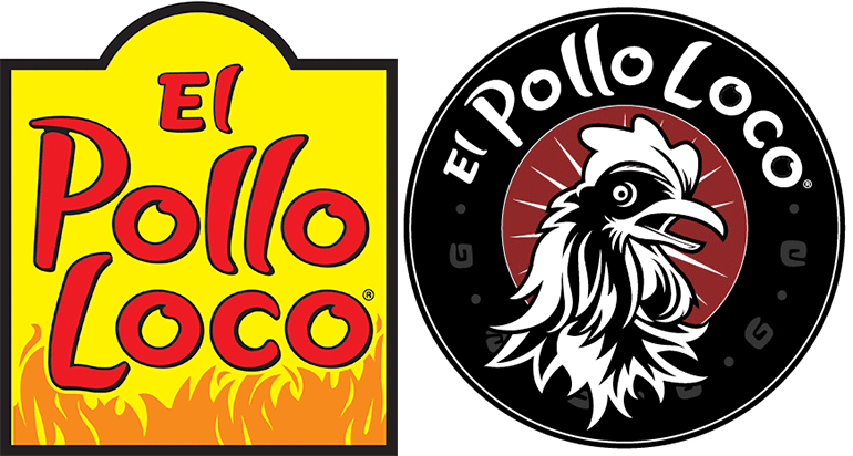
(left) Old El Pollo Loco Logo, (right) New logo. Source: nrn.com
Popular for its Mexican-style grilled chicken dishes, the company made a departure from its original bright red and yellow logo to an oval, black, white and red logo with a chicken in the centre, while keeping its original legacy typeface to pay homage to its Los Angeles roots. This new logo uses white and black making the chicken and its name very prominent reflecting its motto of slow grilled chicken and fast service.
Cool Restaurant Logos (3 logos)
These logos tend to be more eye-catching while also communicating your restaurant’s value, brand, ambience and cuisine. At first glance, customers can understand your vision, values and concept, thus forming a lasting impression.
i. Comaxurros
Specializing in Churros, this logo is composed of a set of characters and story driven elements that depict a lively and vibrant ambience. The bright, bold colours are eye-catching and gives a sense of fun.
The image in the logo resembles that of a torn beer label with their font and colours making the logo prominent and good on all printing materials and advertisements.
iii. Damn the Weather

You know the designer’s got it perfect when a logo makes you think of the wet weather in Seattle, WA and you would be happy to dry yourself off and have a drink. The minimalism and simplicity of the font and umbrella image makes it unforgettable.
-
Creative Restaurant Logos (3 logos)
Creative logos tend to be more unique in its design by pairing typography with colours, fonts and styles.
i. Delice Perle
This unique and cute smiling waffle image with the elegant typography makes it eye-catching and reflects the fun and casual vibe of the cafe.
ii. Bubbel & Brie
As a cheese food truck that offers amazing cheese dishes, its name translates as ‘Champagne & Brie cheese’. This logo uses unique typography with green and yellow colours making it memorable and reflects its easy going and fun atmosphere.
iii. High Tide Poke Shop
This poke bowl’s logo is straight to the point pairing the fish in the bowl and stands out in simplicity with its use of cyan, orange and white colours.
Modern Restaurant Logos (3 logos)
Modern restaurants have a personal touch when it comes to their customers and easily build a loyal following. Your restaurant logo should reflect this with your graphics, colours and typography.
Unique and creative typography used to reflect the cuisine of the restaurant with the creative use of the ‘O’, making the words ‘Hot Pot’ resemble people sitting around a hotpot. Its use of red, white and black makes the logo very striking and memorable.
ii. Belgium Blues by Kanades
Sometimes all you need are bronzed coloured classic font with a unique ‘B’ typography for your logo to stand out. This logo looks very elegant and classy whether it is on your restaurant windows or your tableware.
iii. Union King’s Cross Pizzeria by Marie Kasian for EVNE Developers
The creative pairing of a wine glass and pizza slice image in a simple black and white design makes this logo stand out. The font in circular text resembling that of a pizza matching the restaurant’s cuisine has us all thinking of having pizza.
Cafe Logos
Express your bar or cafe’s ambience by reflecting it in your restaurant logo design. What will your dining experience be like? What type of food and drinks will you be serving? You may consider using logos that capture the mood of your restaurant, such as using softer fonts for a relaxing ambience or black to create a classy chic look.
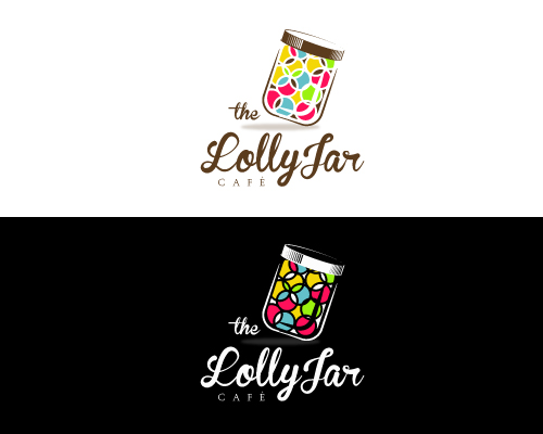
i. The Lolly Jar Cafe by JTdsign
Source: designcrowd.com
The cute colour lolly jar image is a direct reference to its name while its use of modern cursive typography gives it a classic look.
ii. Brown Logo Design by Pixelgrapix
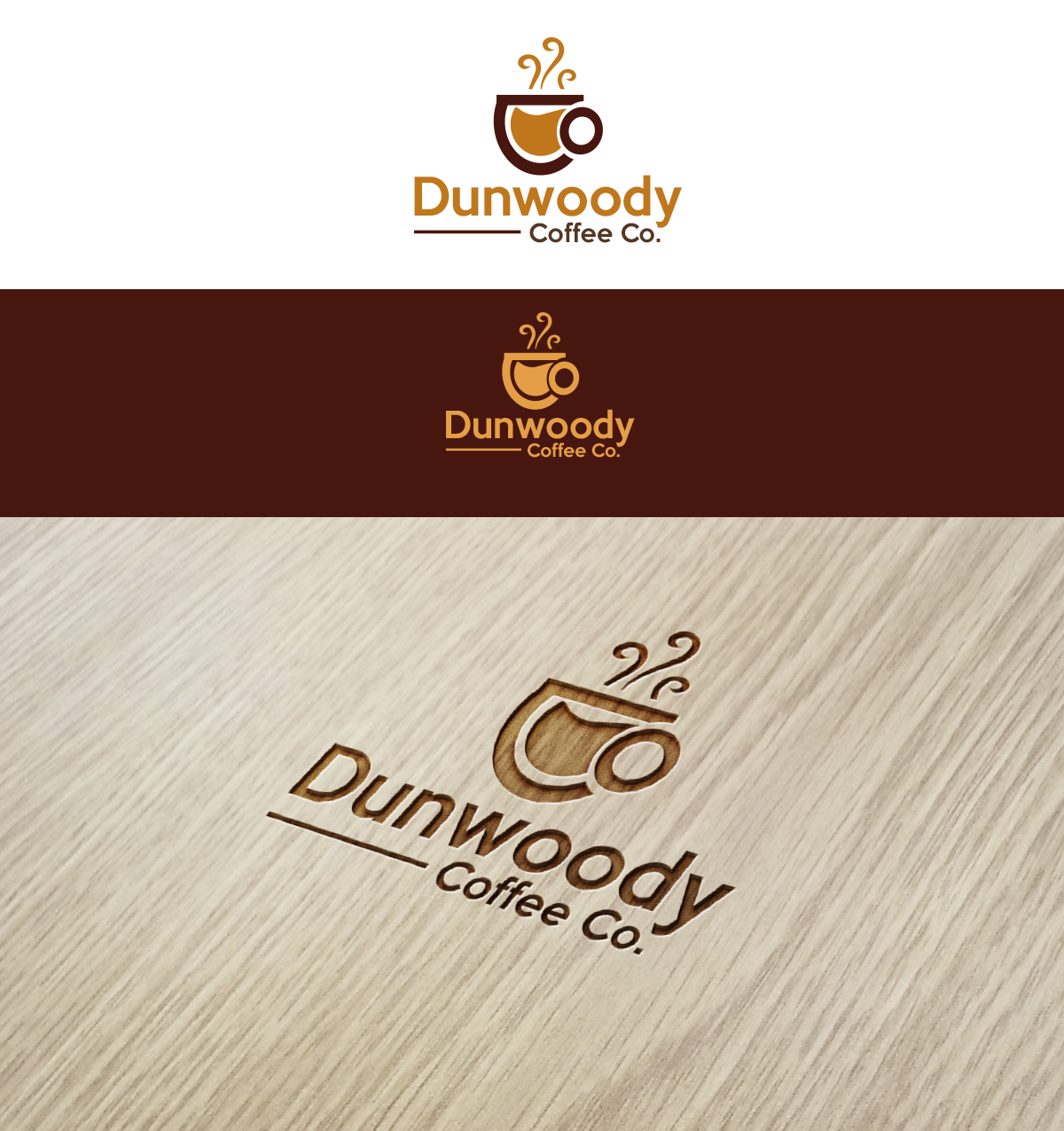
It’s not hard to imagine steaming cups of coffee with their cute steaming coffee cup image. Combined with the simple font and warm earthy colours, it makes the logo stand out.
iii. Africa Logo Design by Rossini11
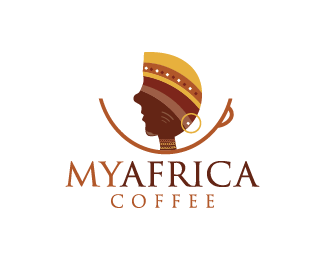
This logo is instantly eye-catching and memorable with the creative pairing of an african lady and a coffee cup. It immediately communicates the coffee origin and authenticity of the cafe’s coffee. Coffee comes to mind with the different shades of brown in the logo.
Bar Logos
iv. Casey Magee’s Irish Pub & Music Hall by Dmitry Litvinenko
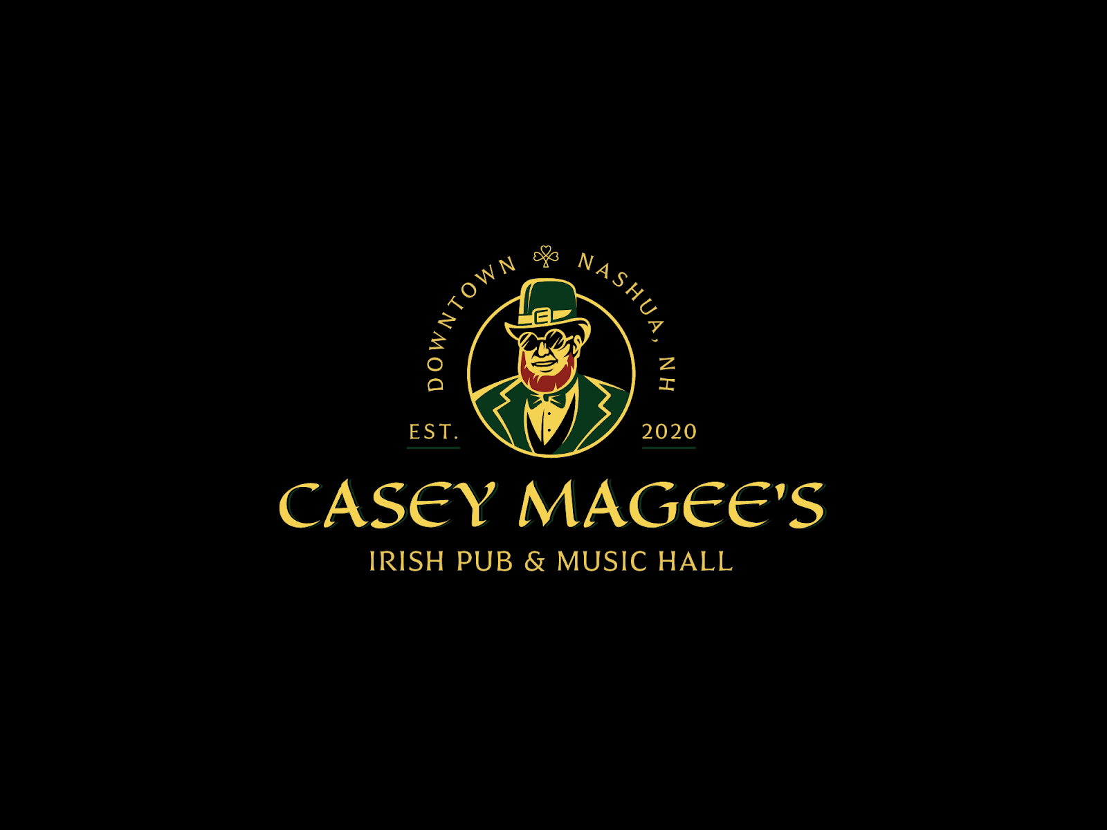
A creative twist to a classic pub sign with a funny image of an Irish gentleman wearing sunglasses. Add the use of yellow and green against black and the image gets a vintage feel to it, making it stand out.
v. Pavian Pub by DIX LIX MIX
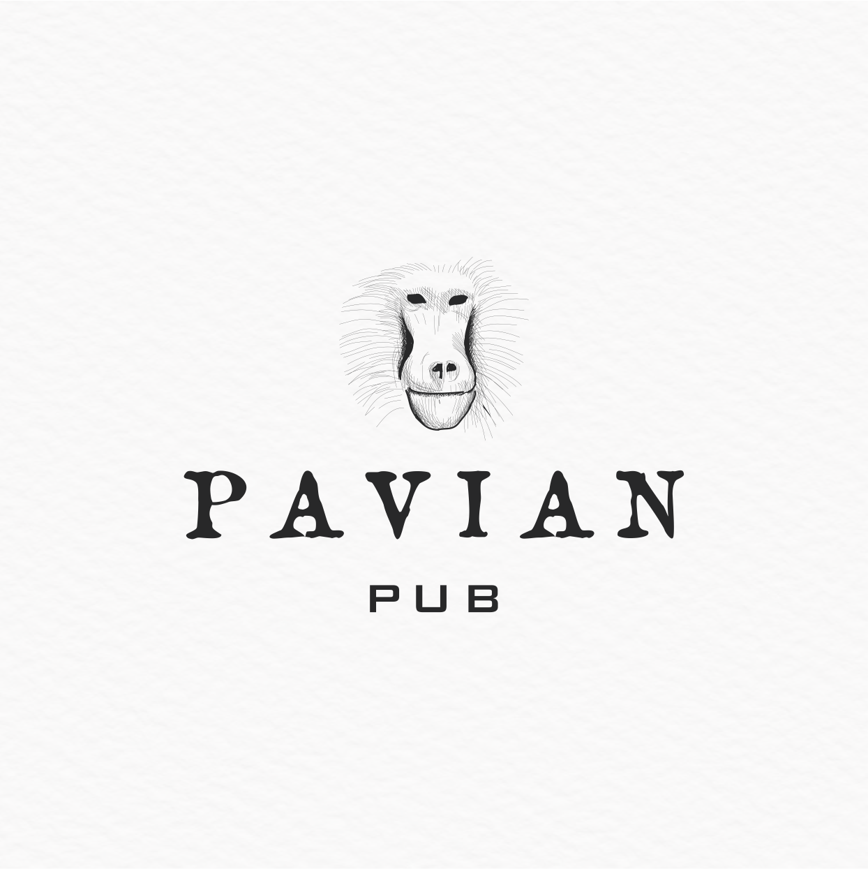
Using a combination of off-white hues with black and grey, the image of the baboon makes this logo very memorable. German for ‘Baboon’, this logo gives off a simple yet stylish vibe of the restaurant.
vi. Well House Inn Logo Design by austinminded
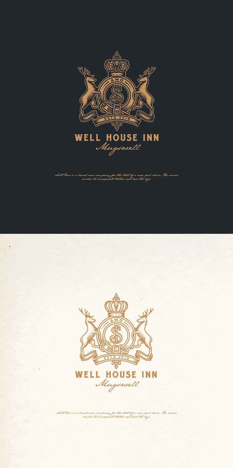
This stylish and elaborately detailed logo looks striking when it comes to advertising your restaurant and printing materials. The unique image, typography and colours describes what you can expect if you come for dinner and drinks.
Conclusion
Now that you have some restaurant logo inspiration, it’s time for you to start creating. Get as creative as you can with brainstorming various ideas to create your very own uniquely amazing restaurant logo today!
With contributions from Darren Foong.


